Problem Statement
Each year, we surveyed MyHouseDeals members to evaluate how well we were meeting their needs. While the platform offered a wide range of investment property listings, user feedback revealed a consistent pain point: members had difficulty locating key pieces of information on property detail pages. This friction in the user experience not only reduced efficiency but also created frustration and decision-making delays for investors who relied on timely, accurate data.
The Work
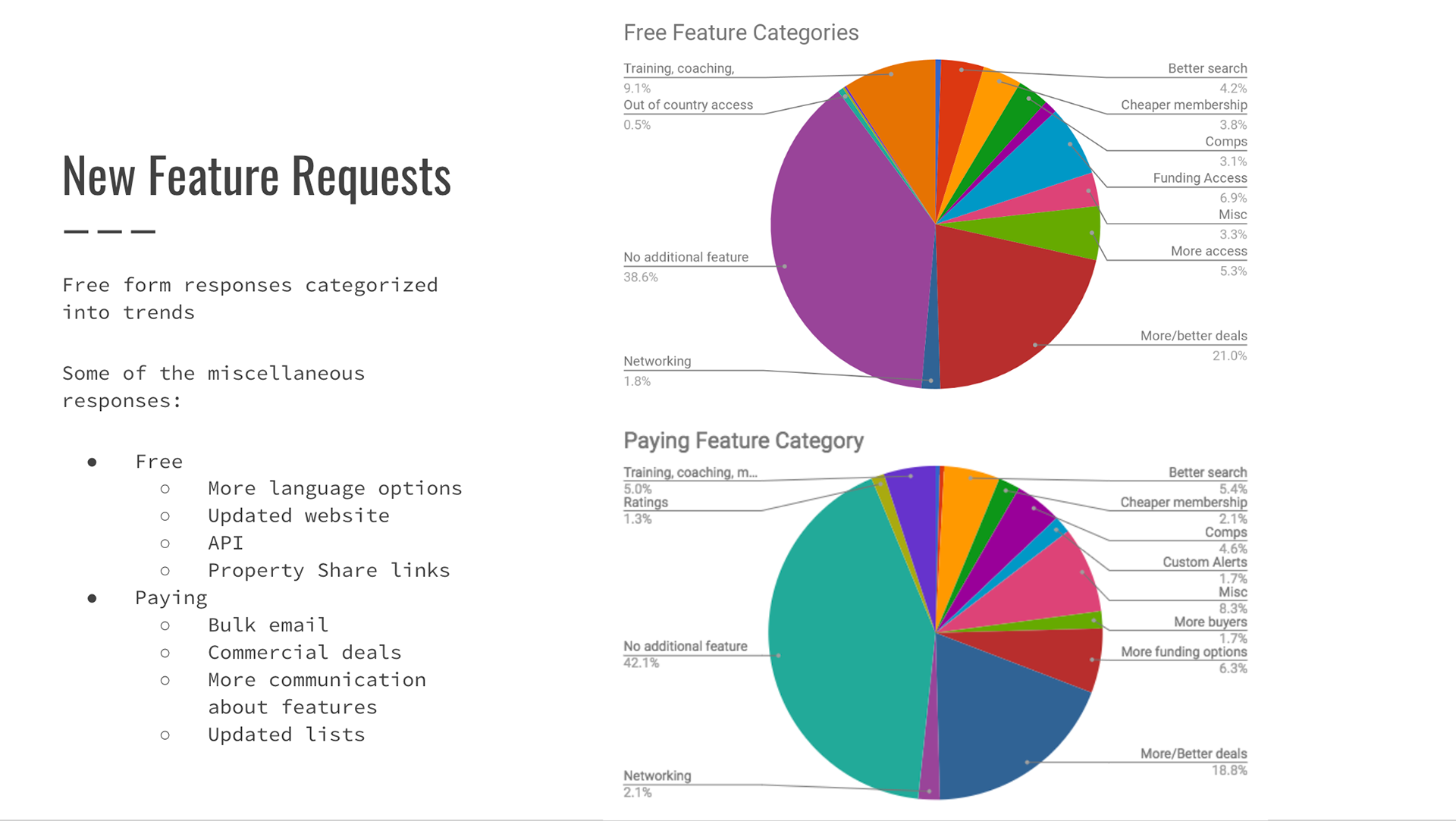
To better understand the root causes of this issue, we began by analyzing results from our annual member satisfaction survey. The feedback highlighted recurring concerns around the visibility and accessibility of critical property details—such as pricing, repair estimates, ARV (after-repair value), and contact information.
Based on these insights, we initiated a round of qualitative research through user interviews to further explore what information mattered most to our members during the property evaluation process. These interviews uncovered specific gaps in the way information was presented and emphasized the need for a more intuitive layout.
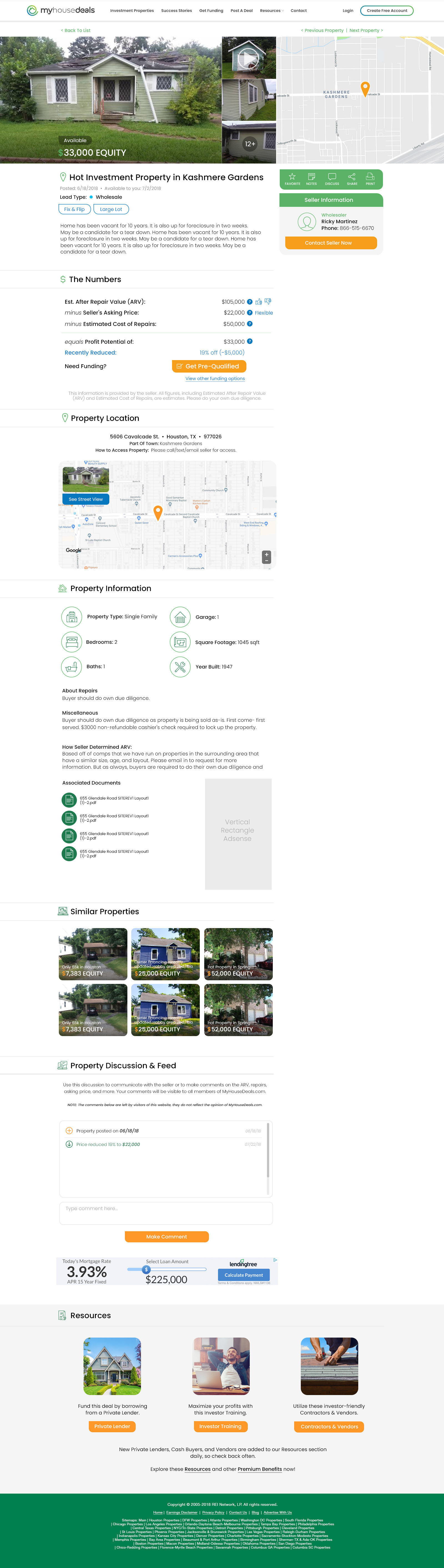
In parallel, we continued to analyze behavioral data and identified clear patterns in the types of information users frequently searched for or overlooked. These findings informed a full redesign of the property details page. The new design prioritized hierarchy and clarity, ensuring the most relevant data points were immediately visible and easy to act upon.
By grounding our redesign in both qualitative and quantitative research, we were able to significantly improve usability and better align the platform with the needs of our investor community.
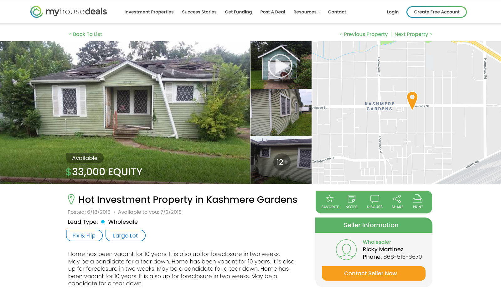
Proposed User Flow
Member searches for property >>> Member sees property details >>> Member is allowed certain pieces of property information based on their membership type >>> Member has all important property information easily accessible above the fold of the page
Ideate & Sketch

Designs & Views

Testing
To measure the effectiveness of the redesigned property details page, we identified four key metrics to track:
1. Time spent on the page – comparing the redesigned version to the original
2. Number of clicks – indicating user engagement with the content
3. Abandonment rate – to assess whether users were dropping off before taking meaningful action
4. Membership conversion rate – the percentage of users who signed up after viewing the page
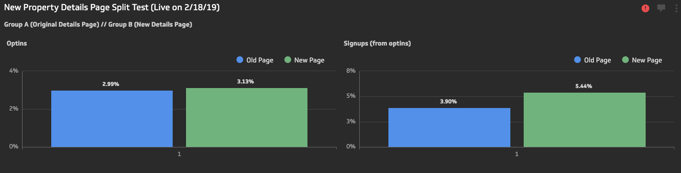
We implemented an A/B test to evaluate performance, splitting website traffic evenly: 50% of users were shown the original design, while the other 50% experienced the redesigned version.
The results exceeded our expectations. Membership conversion rates increased by 30%, while time spent on the pageand click activity nearly doubled. These improvements also contributed to a notable reduction in abandonment rate, validating the success of the redesign in both engagement and conversion outcomes.